Canonical UK · London · 2013
Commerce built directly into the operating system — a full purchase checkout inside the Ubuntu Dash, without a browser, without disruption.
Overview
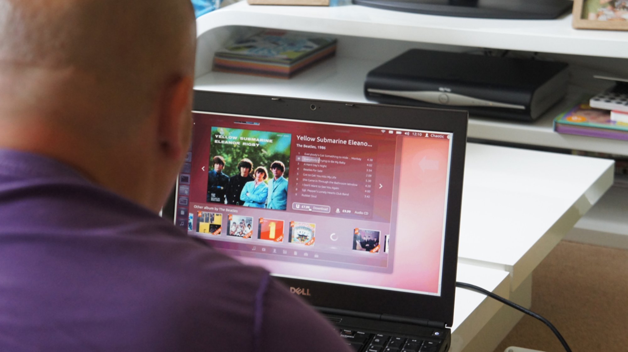
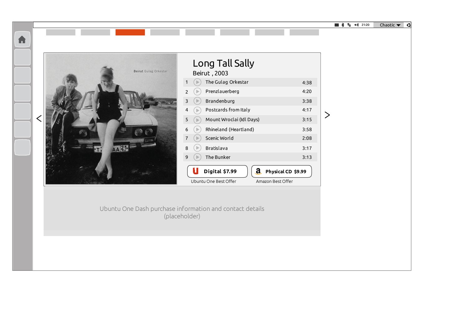
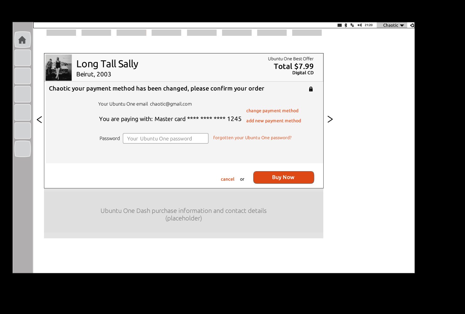
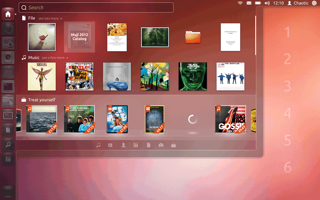
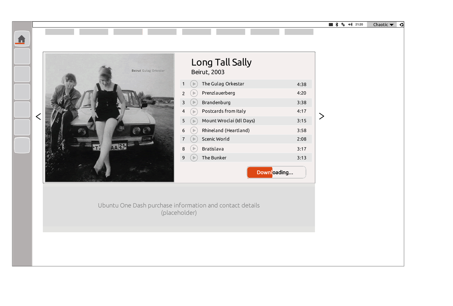
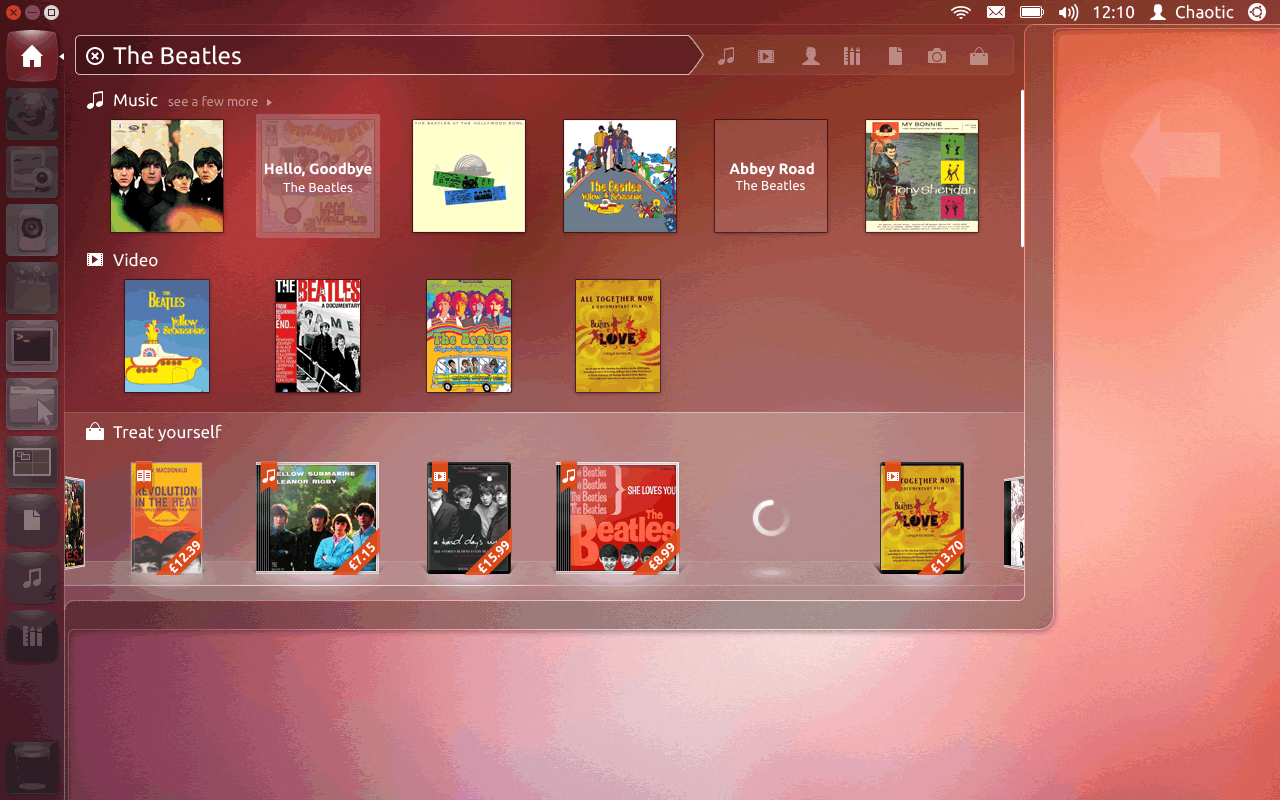
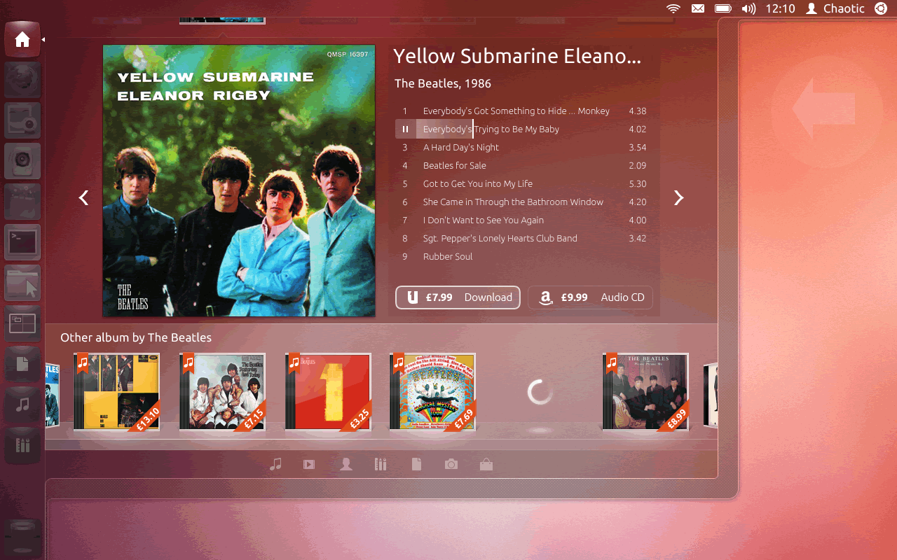
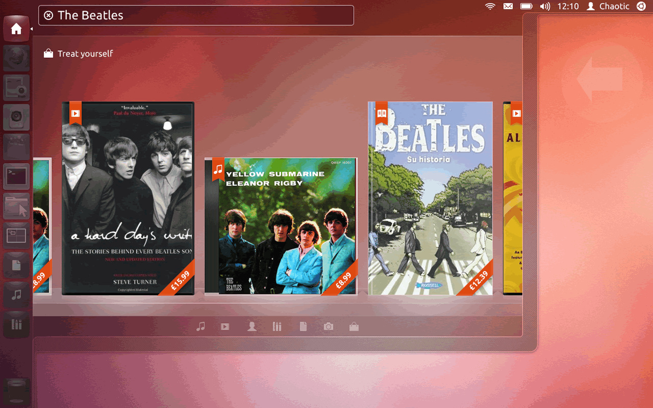
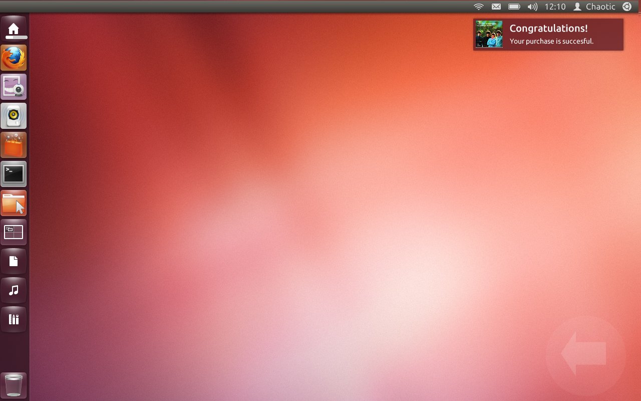
Ubuntu Pay was Canonical's vision for native commerce on the Ubuntu desktop — a checkout experience woven directly into the Ubuntu Dash, the OS-level search and content discovery layer. Rather than redirecting users to a browser to buy music, apps, or media, Ubuntu Pay brought the entire purchase flow inside the operating system itself.
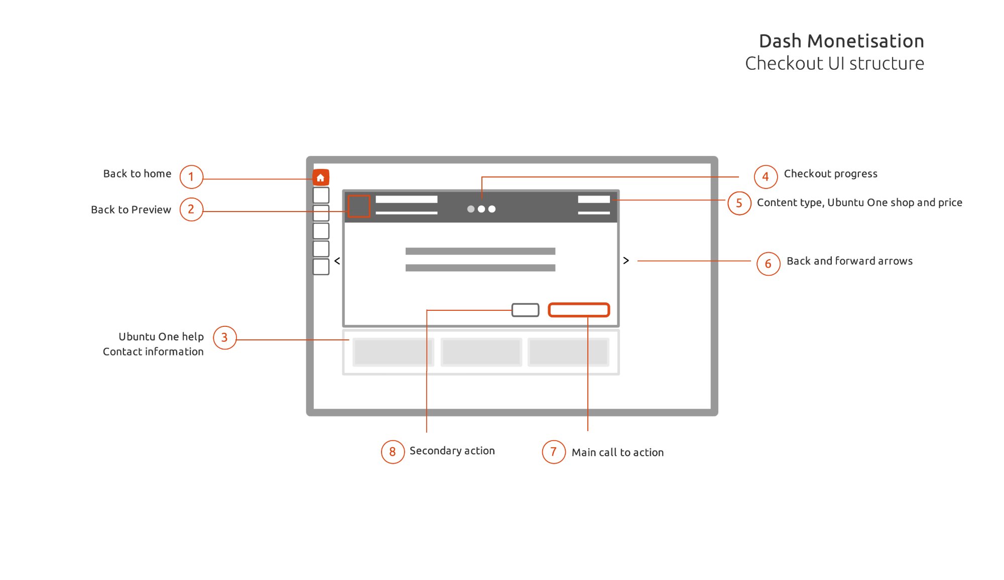
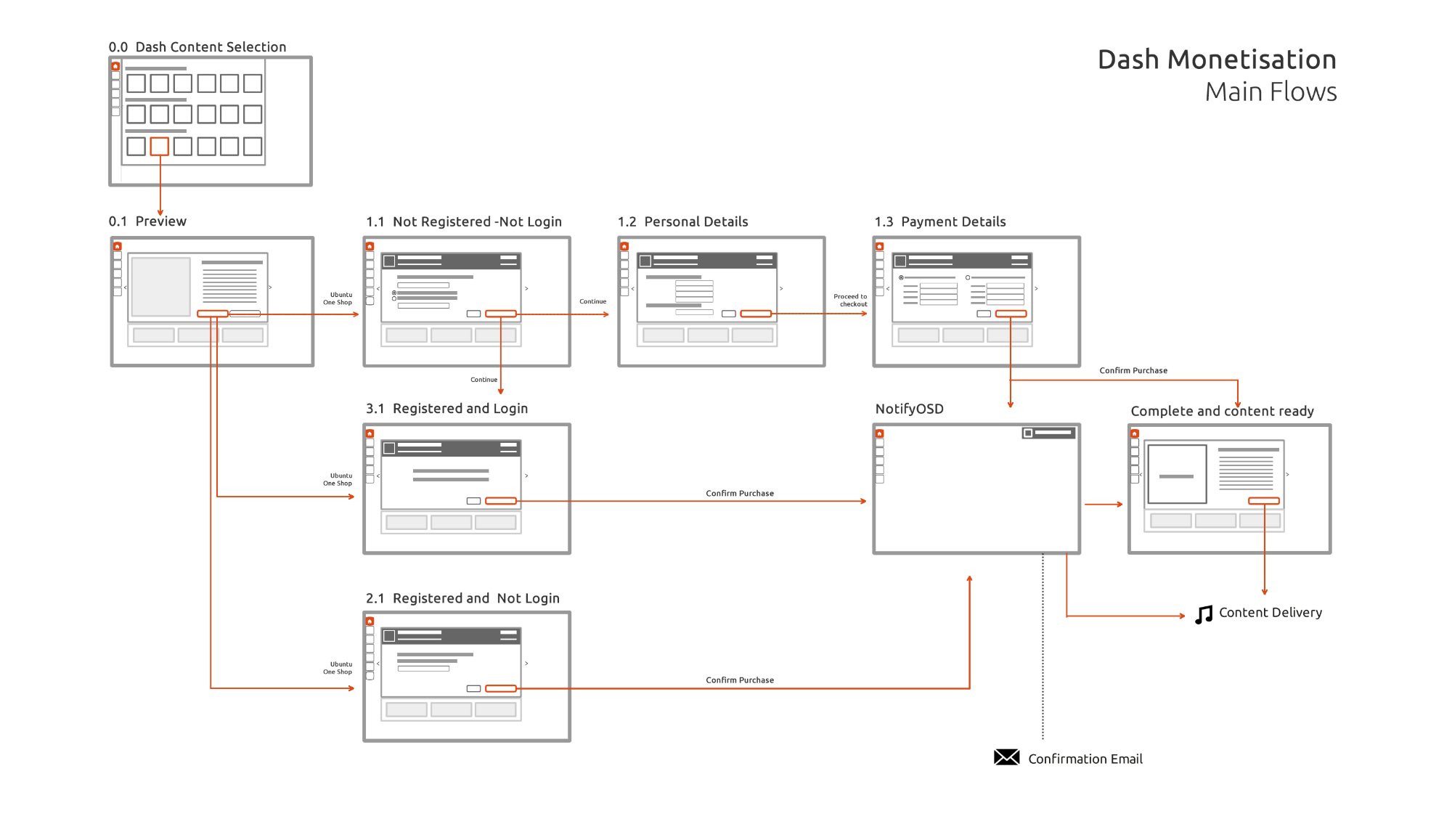
As UX Lead, I designed the end-to-end Dash Monetisation checkout experience — from content discovery in the Dash through preview, purchase, payment, and download — using Ubuntu One as the identity and payment backbone, with Amazon as an alternative purchase path.
This was a genuinely novel design challenge: a trusted, frictionless commerce flow in an environment where users had never seen a checkout screen before.
The Ubuntu Dash Home — commerce integrated at the OS level. "Treat yourself" surfaces priced content (music, books, apps) with prices shown directly on album art.
The Design Challenge
The Ubuntu Dash was a search interface — not a store. Introducing commerce into it meant designing a checkout experience that felt native to the OS, not bolted on from a browser. Users needed to trust it immediately, complete a purchase in seconds, and return to what they were doing without feeling like they'd left the operating system.
Users had never bought anything inside their OS before. The checkout had to communicate security, legitimacy, and Ubuntu One's identity layer clearly and immediately — without any of the visual cues that make browser checkout feel familiar.
Three user states — not registered, registered but not logged in, registered and logged in — each needed a different checkout path with the right number of steps and zero unnecessary friction between intent and purchase.
The Dash is a search tool first. The commerce layer had to surface clearly enough to drive purchases, but never so aggressively that it disrupted the primary discovery and search experience users depended on.
Checkout UI Structure
The checkout UI was designed as a modular system — 8 annotated components that could be composed into any checkout state. This ensured consistency across all purchase flows regardless of content type or user registration status.
Dash Monetisation — Checkout UI Structure. Eight numbered modules: (1) Back to home, (2) Back to preview, (3) Ubuntu One help & contact, (4) Checkout progress, (5) Content type, Ubuntu One shop & price, (6) Back/forward arrows, (7) Main call to action, (8) Secondary action.
User Flow Architecture
The main flow diagram mapped every route a user could take through the checkout — from content selection in the Dash through to download and content delivery. Three distinct paths depending on registration status, each merging at the payment confirmation step.
Dash Monetisation — Main Flows. From content selection (0.0) through preview (0.1) to three checkout paths: not registered (1.1→1.2→1.3), registered and logged in (3.1), registered not logged in (2.1). All paths converge at Confirm Purchase → NotifyOSD → Content Delivery.
Purchase Flow Screens
The purchase flow moved users from browsing content in the Dash, through a preview screen showing the full track listing and price comparison, to a streamlined payment confirmation — all without opening a browser.
Content preview — full track listing with two purchase options: Ubuntu One digital ($7.99) and Amazon physical CD ($9.99). Best offer labelling surfaces the Ubuntu One advantage.
Payment confirmation — personalised to the user (Chaotic), showing saved Mastercard, password entry, and a single "Buy Now" CTA. Change/add payment method links handle edge cases.
Ubuntu Dash Music scope — The Beatles' Yellow Submarine / Eleanor Rigby album with "Download £7.99" (Ubuntu One) and "£9.99 Audio CD" (Amazon) purchase options surfaced directly in the content view.
Ubuntu Pay in use — browsing and buying The Beatles without ever leaving the OS.
In Motion
The animated prototypes show the complete experience — from the Dash home surfacing purchasable content, through the full buy flow, to the downloading state and content delivery confirmation.
Dash home — content discovery with pricing.
Full buy flow — preview to payment confirmation.
Post-purchase — downloading state with progress.
Three User States
A core design challenge was handling three distinct user states without fragmenting the experience. Each state needed a different checkout path — but the same visual language, trust signals, and interaction model throughout.
Full registration flow: personal details (1.2) → payment details (1.3) → confirm purchase. Longest path but necessary to capture new Ubuntu One users during the moment of purchase intent.
Login step inserted before confirmation. Shorter than full registration, but required re-establishing identity before any payment was processed. Password recovery link always visible.
The ideal path (3.1): content → confirm purchase with saved card and password field → done. Minimal friction, maximum trust. This was the state we optimised for returning Ubuntu One users.
User Testing
To validate the purchase flow, we built and tested six distinct prototype options — each exploring a different approach to surfacing purchasable content in the Dash and moving users through the checkout. Testing six options in parallel let us identify which visual hierarchy and interaction model users responded to most naturally — before committing to the final design.
Option 01
Option 02
Option 03
Option 04
Option 05
Option 06
The final moment — an OS-level NotifyOSD notification: "Congratulations! Your purchase is successful." No browser, no redirect. The user is back on their desktop.
"Virtually anything you can discover in the Dash can be purchased and downloaded — no browser, no redirect, no disruption to your flow."
Ubuntu Pay — Dash Monetisation Design Vision, Canonical UK, 2013
Outcomes & Impact
Ubuntu Pay was one of the first attempts to build a full purchase checkout directly into a desktop operating system — without a browser, without leaving the OS experience.
Leveraged Ubuntu One as both identity layer and payment backend — creating a single-account commerce experience that reinforced the Ubuntu ecosystem and reduced checkout friction to a password field.
Eight annotated UI modules and a full flow map provided engineering with a complete, unambiguous specification — enabling consistent implementation across all content types and user states.
My Role
Key Learnings
Users weren't skeptical of the price or the content — they were skeptical of the context. Buying something inside an OS, through a search interface, was genuinely new. Every design decision had to answer the implicit question: is this safe?
The registered-and-logged-in path was the key insight: once a user had established trust with Ubuntu One, the checkout could collapse to almost nothing — a password field and a button. The entire registration flow existed to make future purchases feel like nothing at all.
Designing a modular checkout system — rather than per-content-type flows — meant the system could scale to apps, books, and any future content type without new design work. Modularity wasn't just efficient. It was the architectural foundation.
The Dash was a search tool first. The hardest design constraint wasn't the checkout itself — it was ensuring commerce surfaced at the right moment, with the right weight, without ever making users feel the OS had become a storefront.