My Role
UX Designer
Contractor
- Designed the scheduling and automation UX for the WeMo app (iOS & Android)
- Led rapid prototyping across paper, InVision, Flinto, and Origami
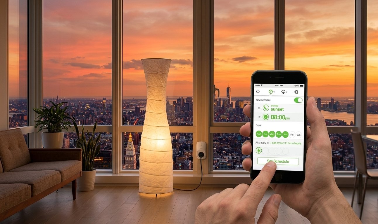
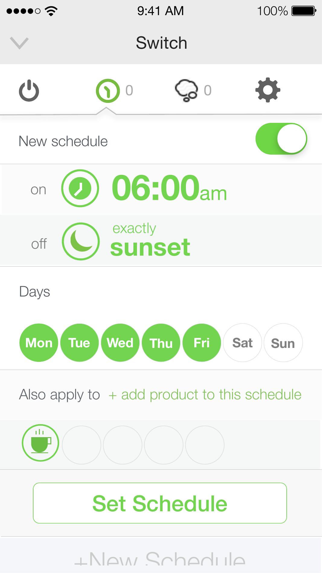
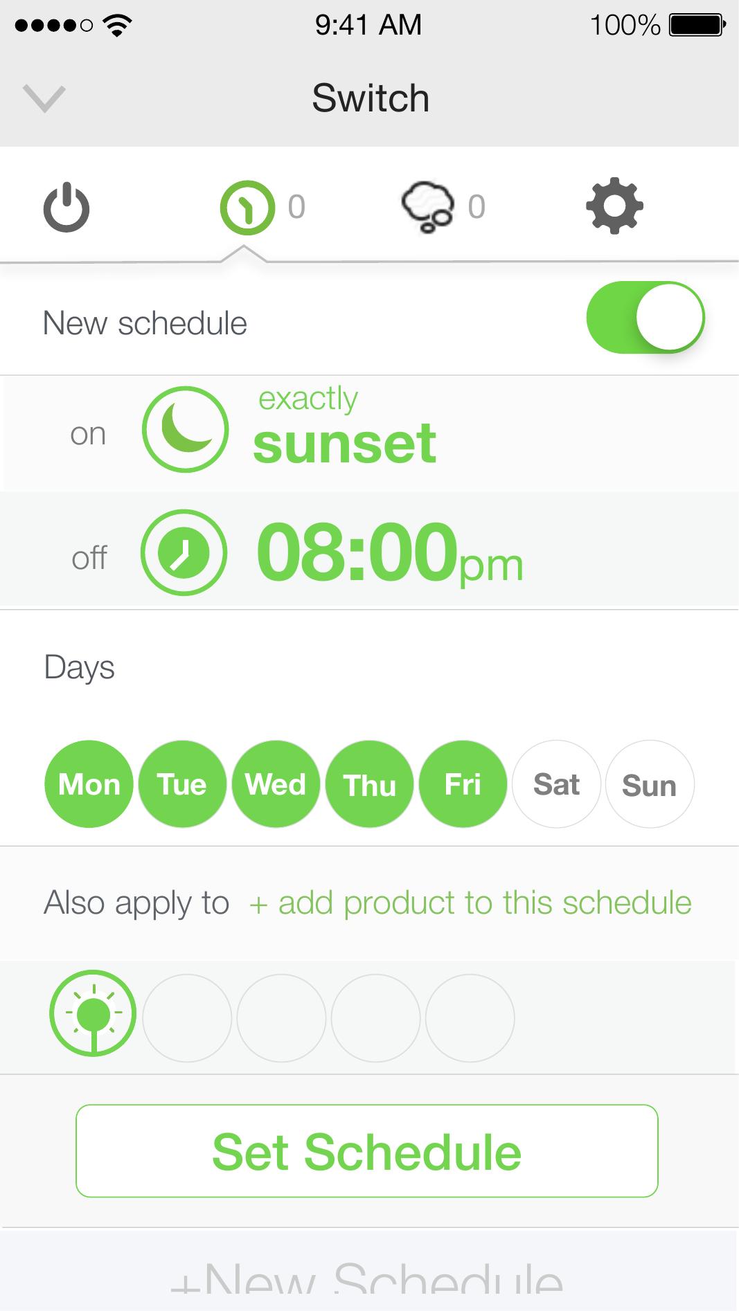
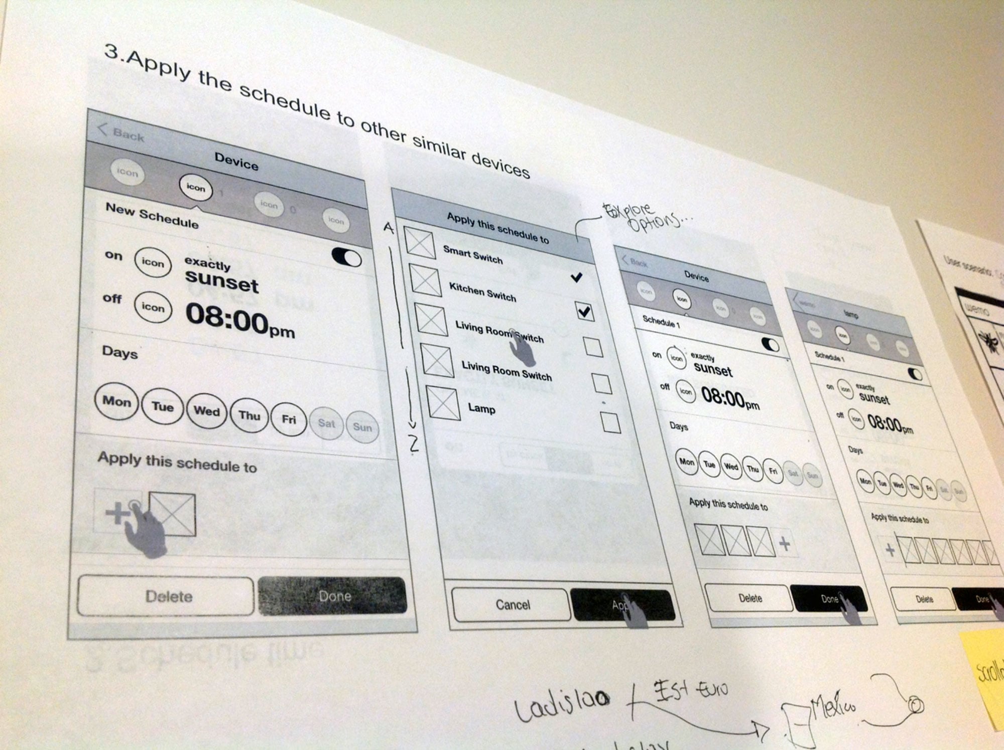
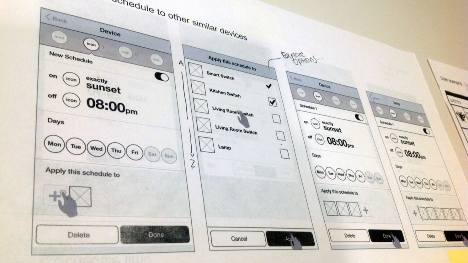
- Designed the "apply schedule to multiple devices" interaction pattern
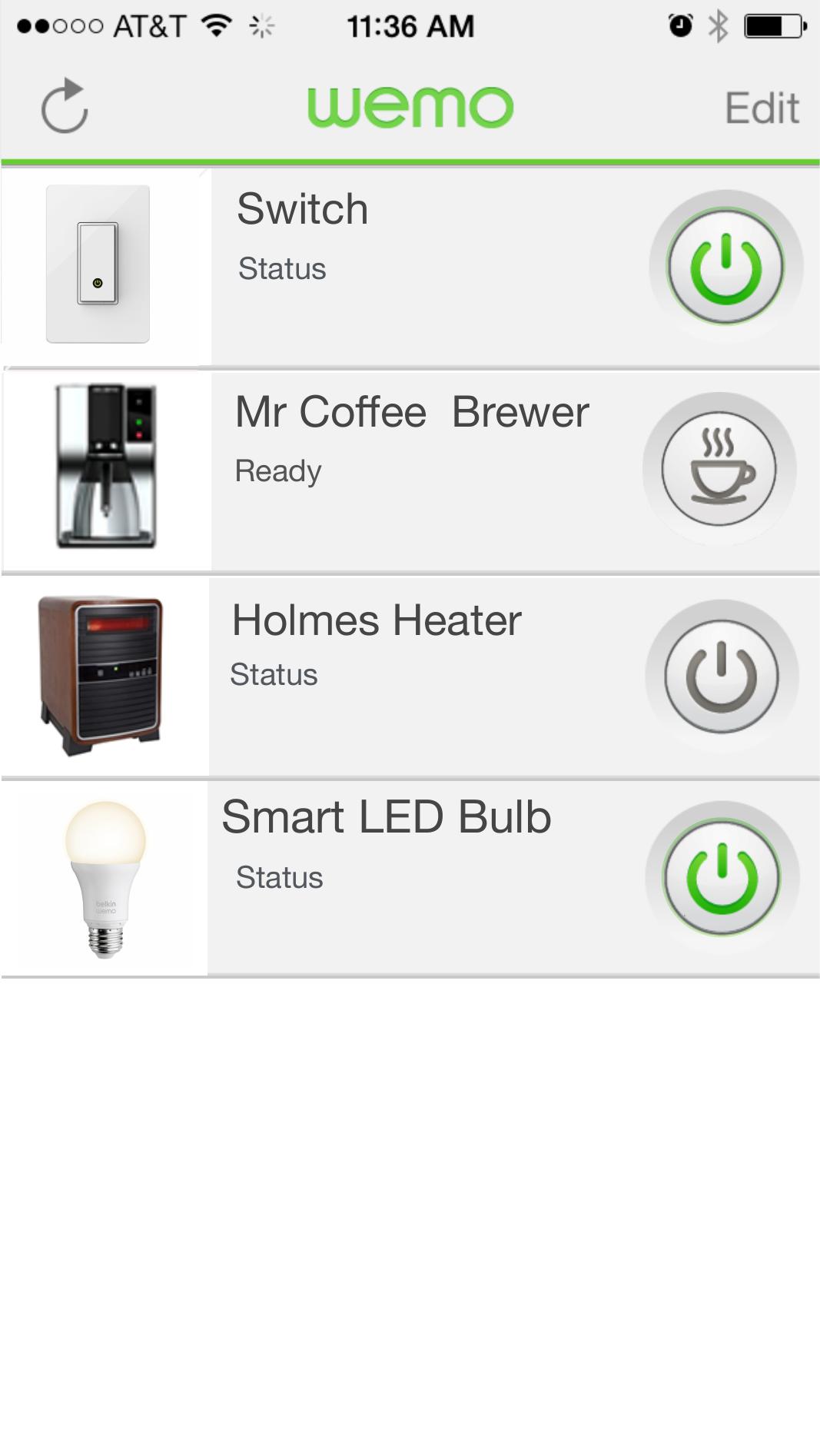
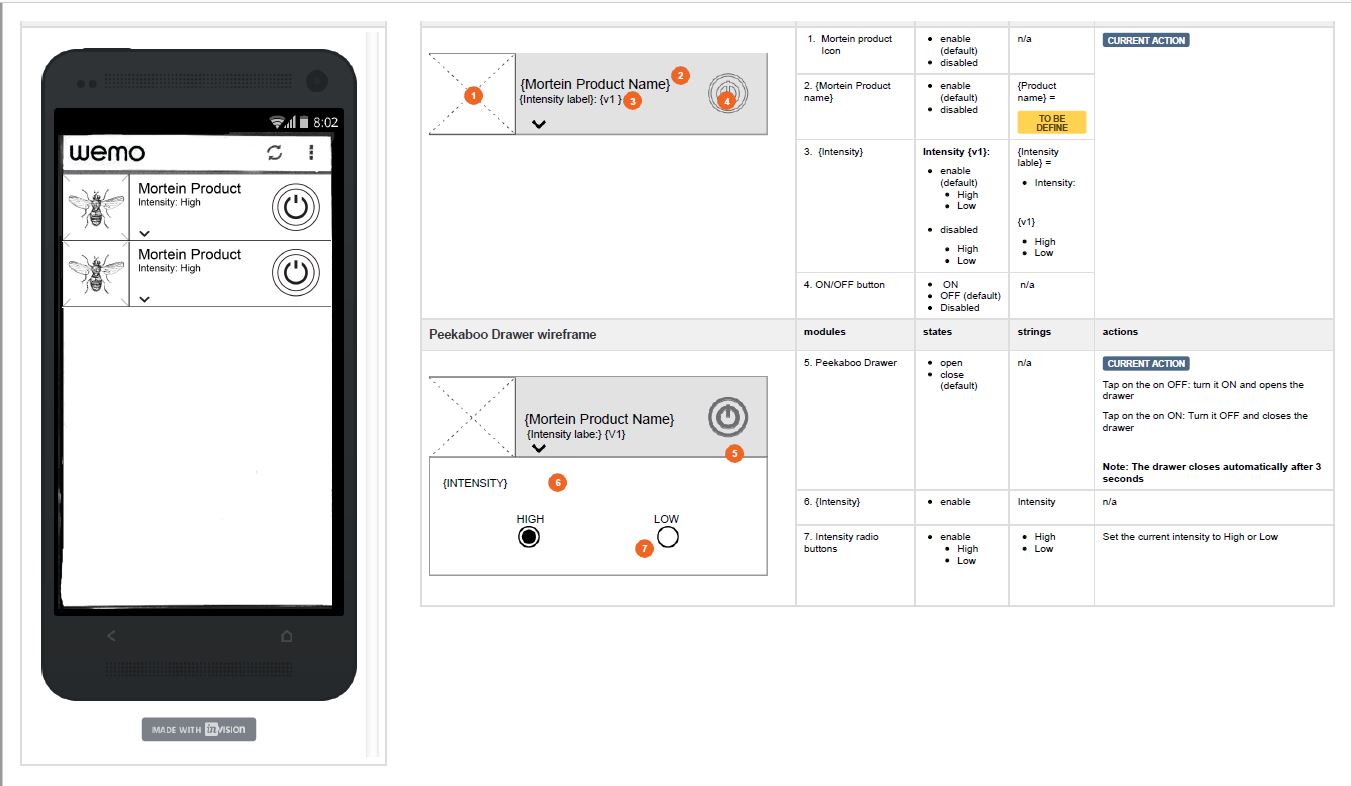
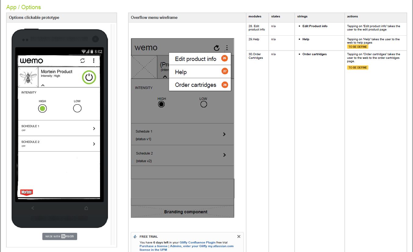
- Built the modular scheduling design system across the WeMo device family
- Collaborated with the visual designer on Origami micro-interaction prototypes
- Produced annotated UI specifications for engineering handoff (iOS & Android)
- Participated in iterative user testing throughout the design process
Key Learnings
Complexity Hides
in the Details
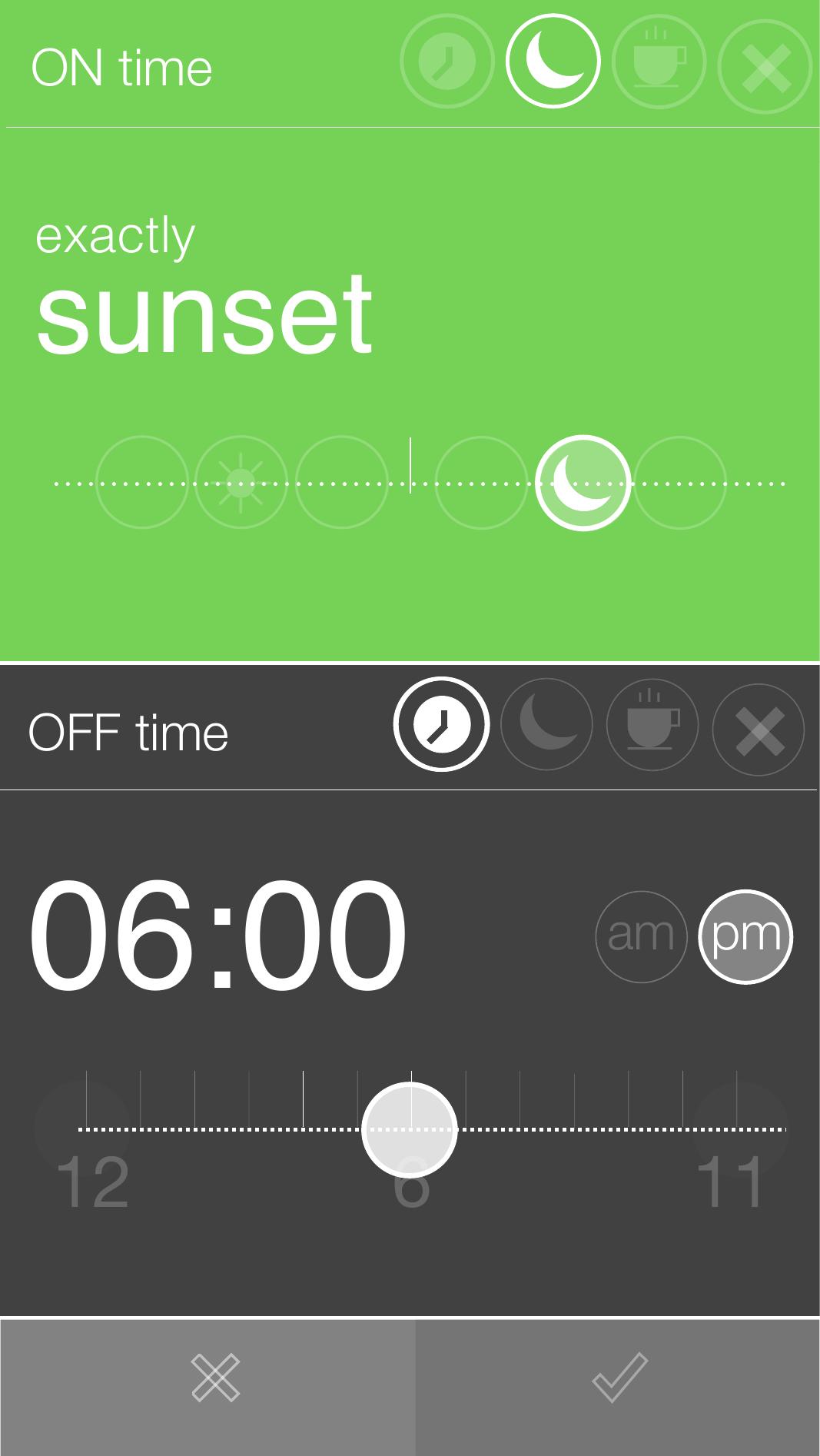
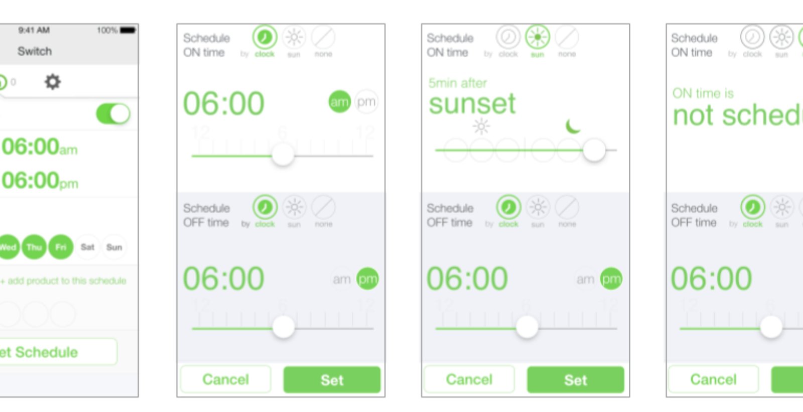
WeMo taught me that smart home UX is deceptively hard. The interactions feel simple — turn a light on, set a schedule — but the edge cases multiply fast. What if the device is offline? What if sunrise varies by season? What if you want to apply a schedule but not to all devices of that type?
Prototyping at the right fidelity was the discipline that kept us honest. Paper caught structural problems. InVision caught flow problems. Origami caught feel problems. Each tool answered a different question — and the sequence mattered.
Working closely with a visual designer on Origami prototypes was a reminder that the best UX decisions happen at the boundary between interaction and visual design — where timing, motion, and layout all meet at once.