My Role
Solo UX in an
Engineering Team
- Sole UX designer embedded in Yamaha R&D team of engineers
- Led all user research, scenario definition, and persona development
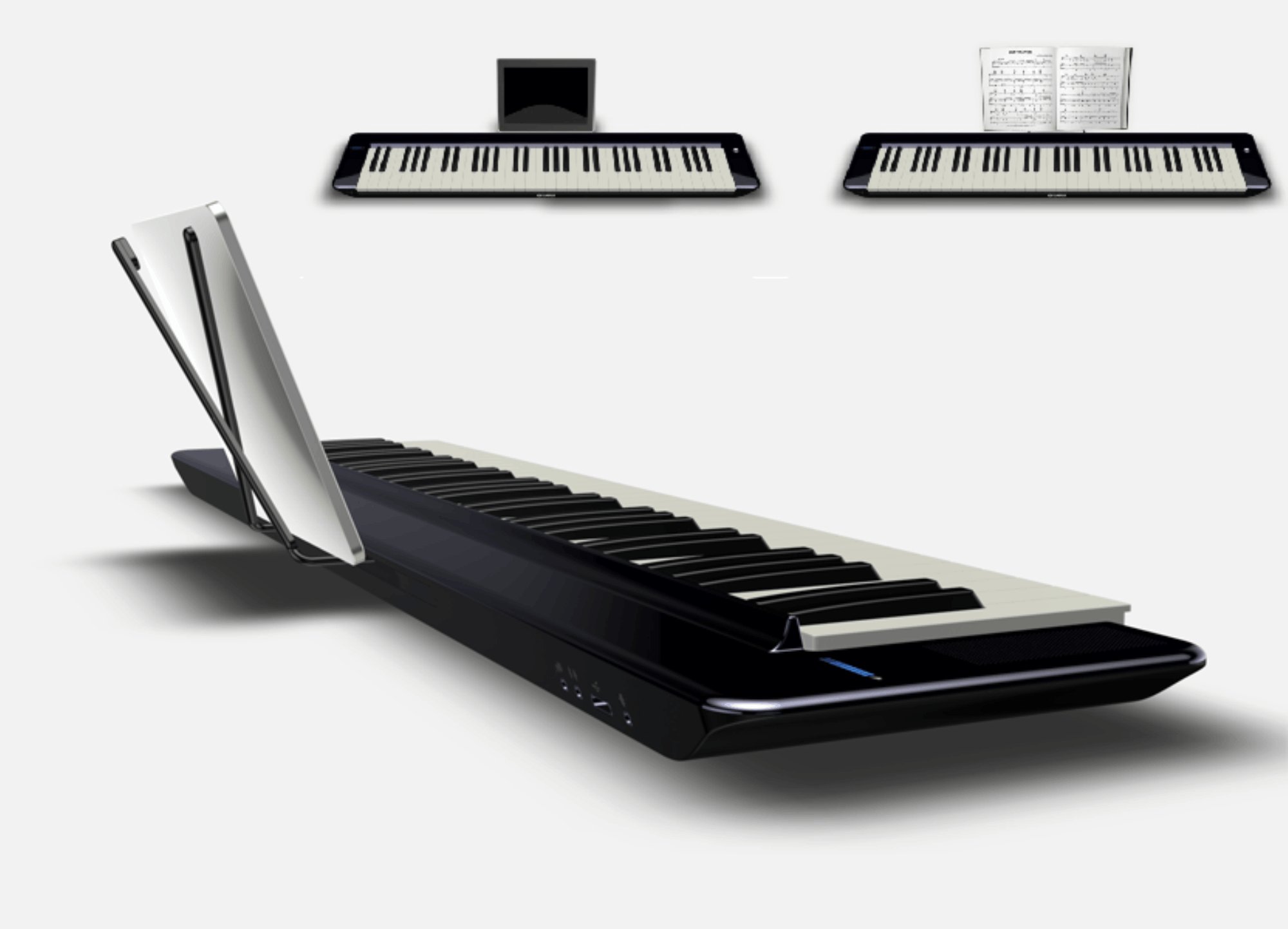
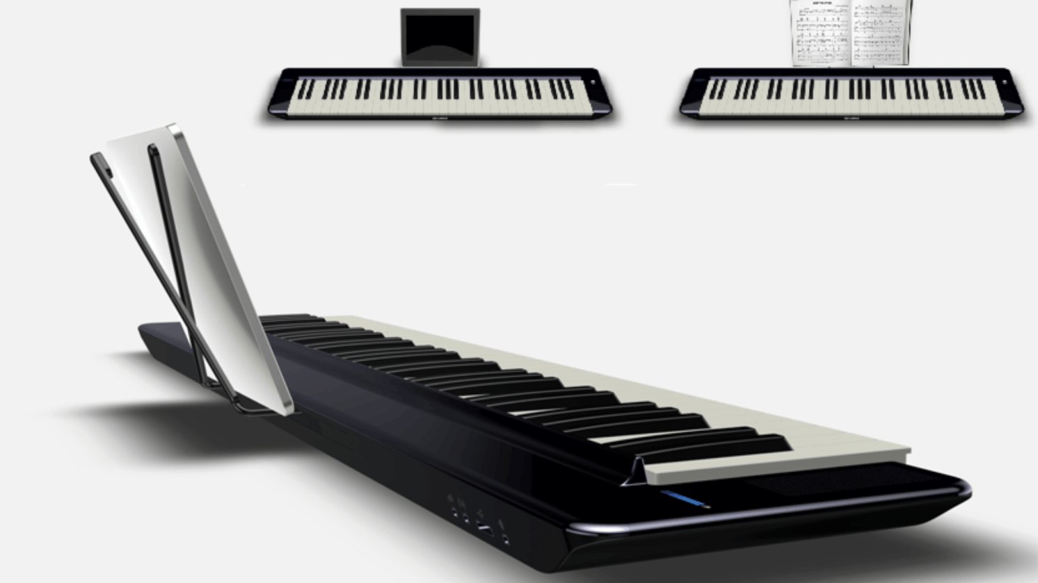
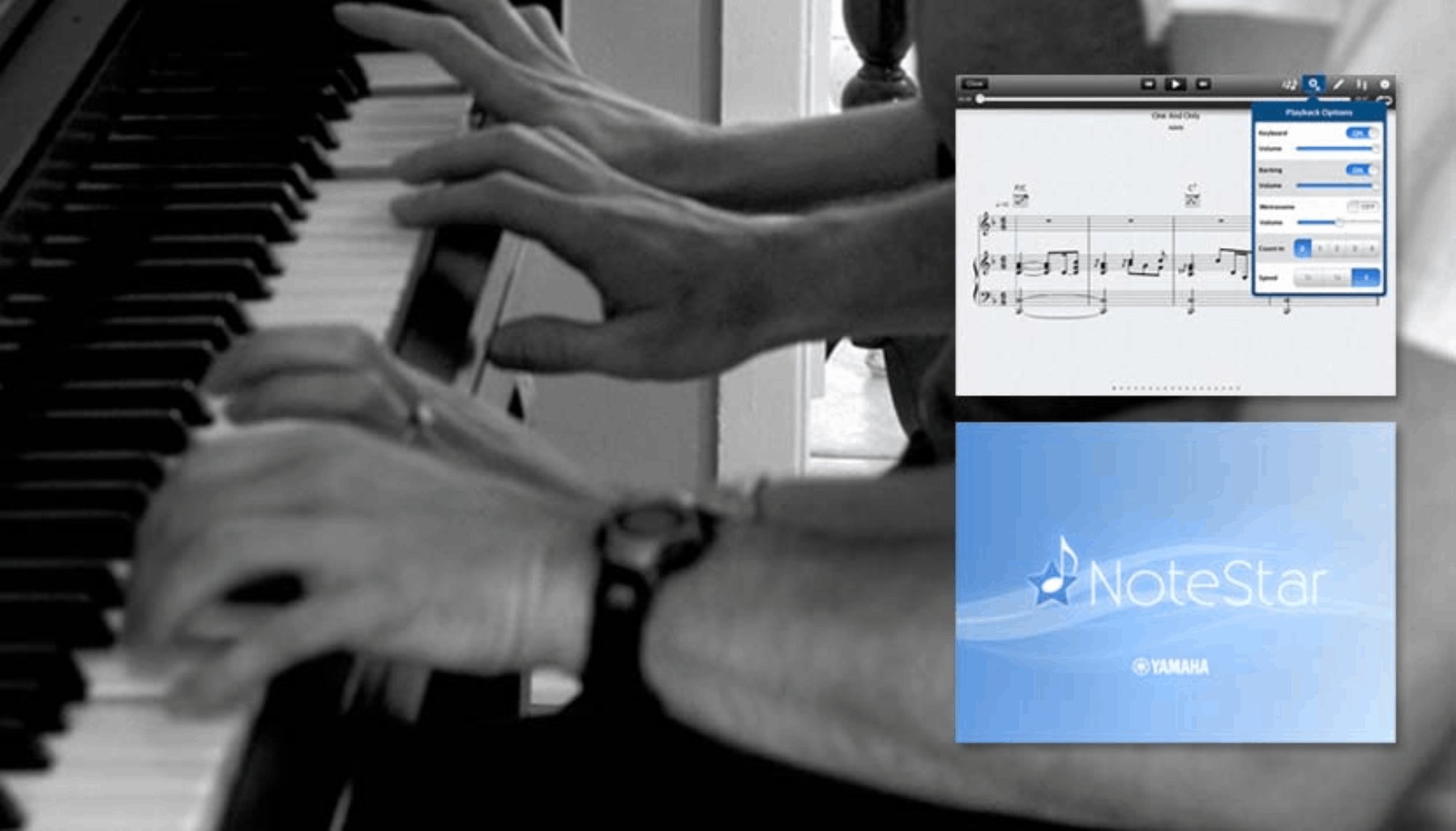
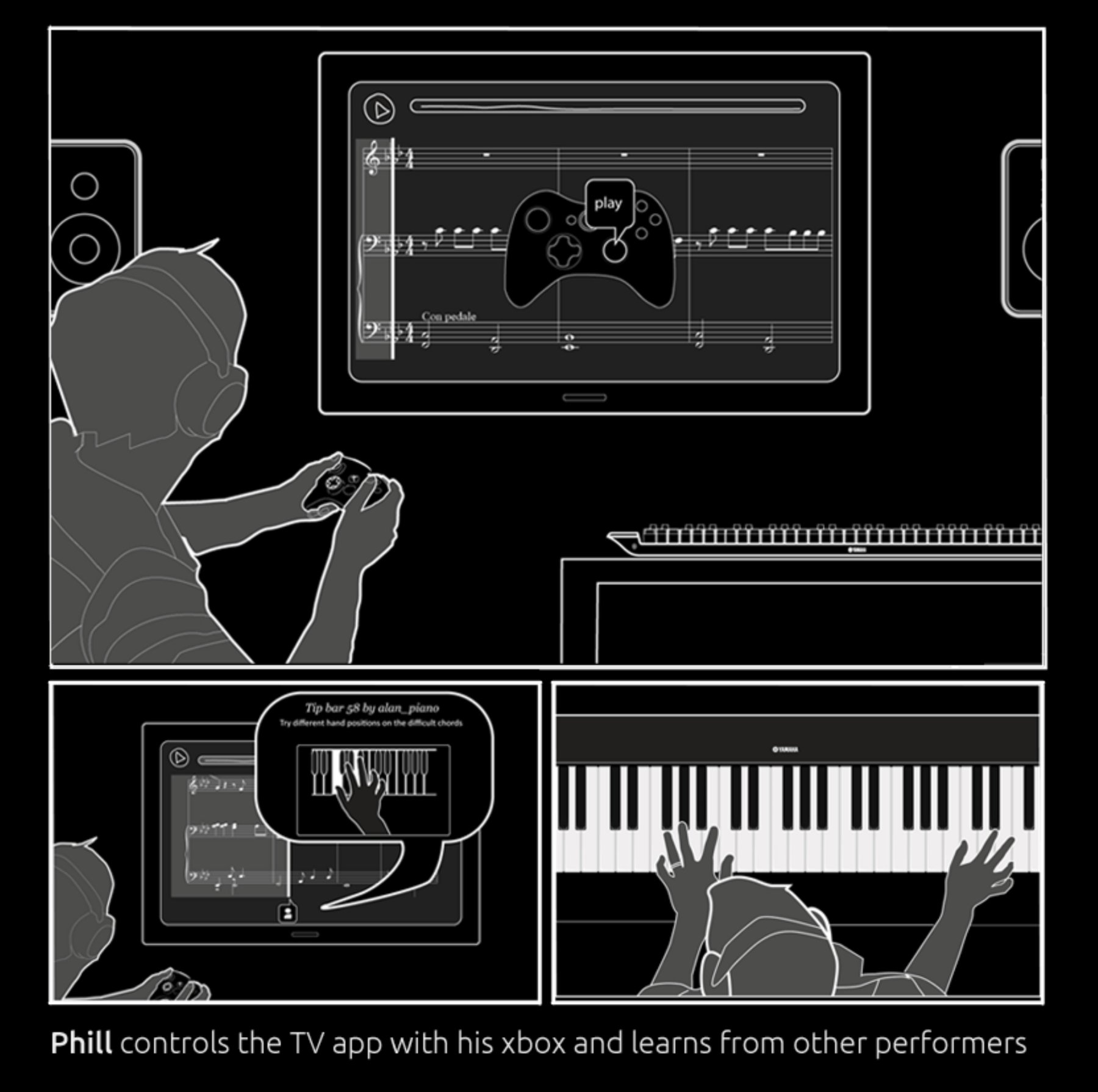
- Sketched and storyboarded the full ecosystem vision
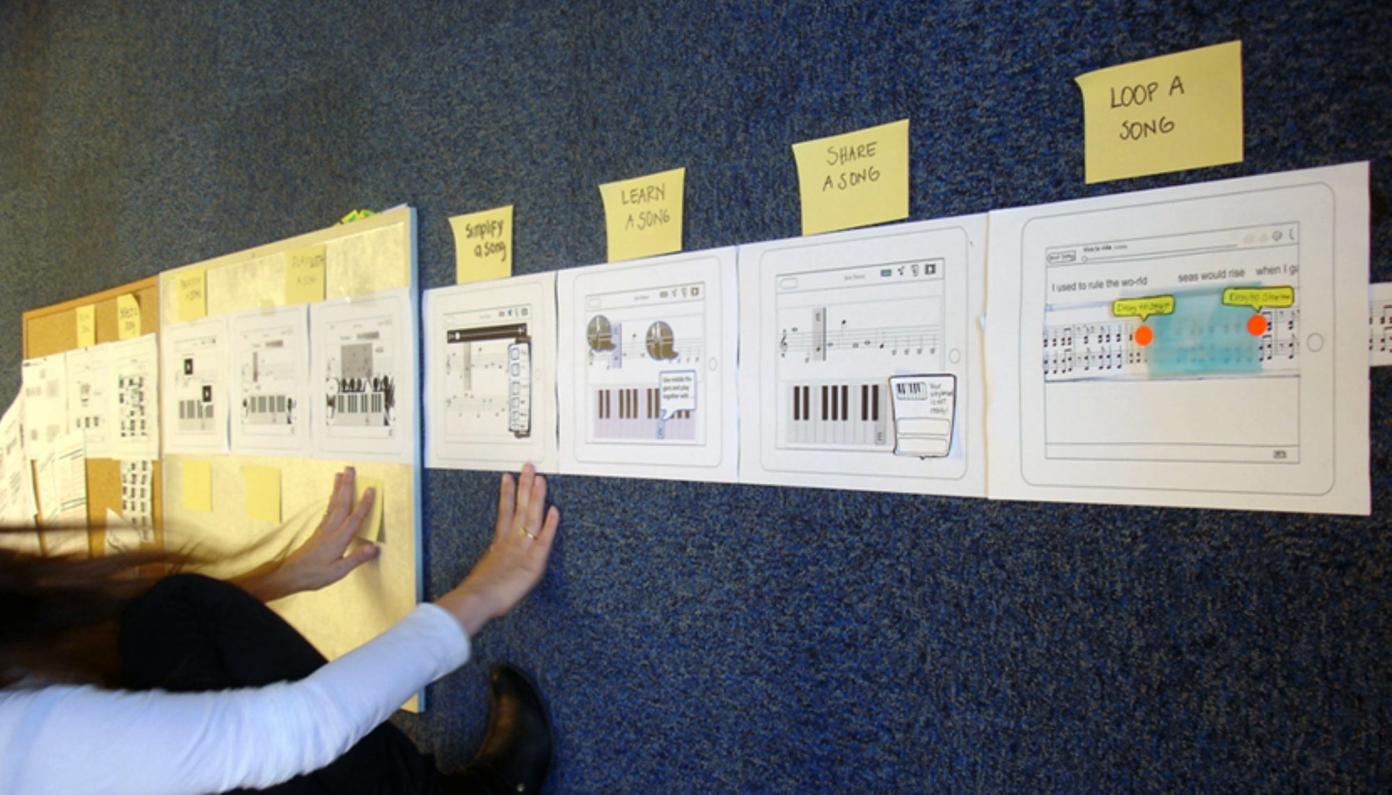
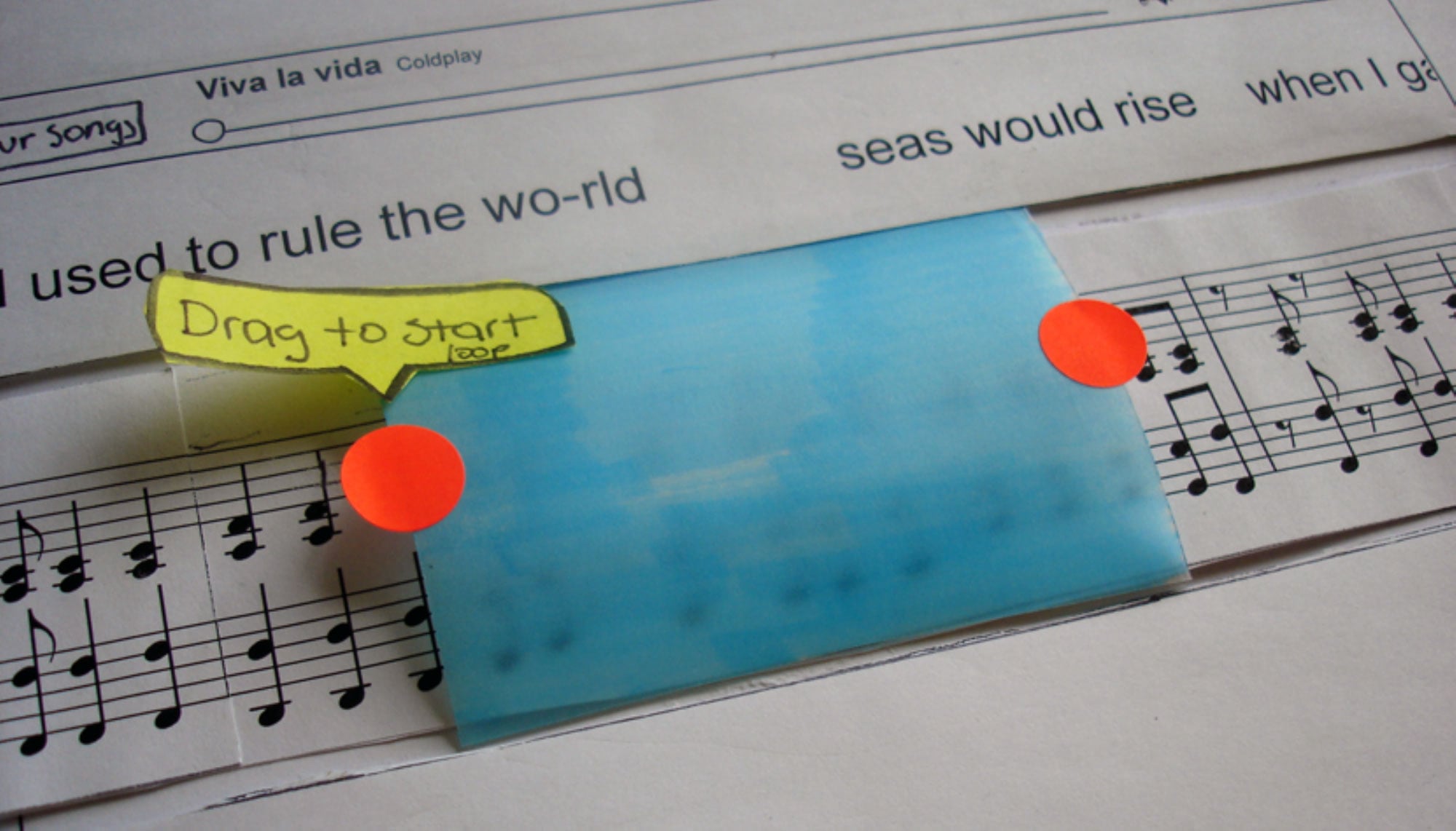
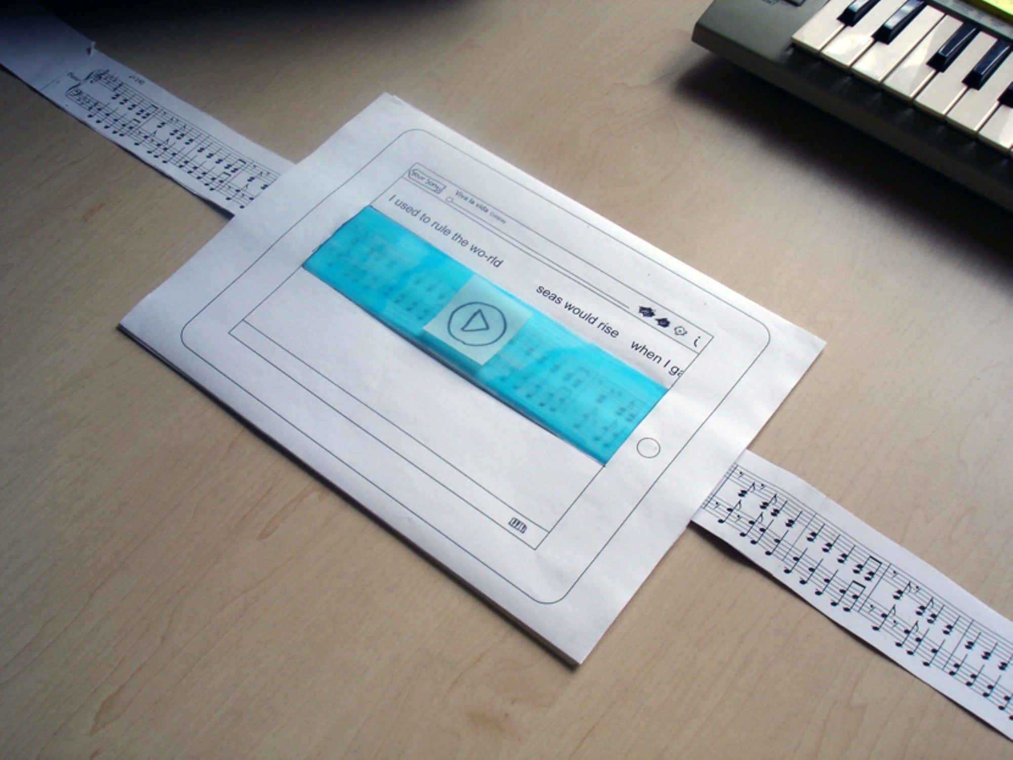
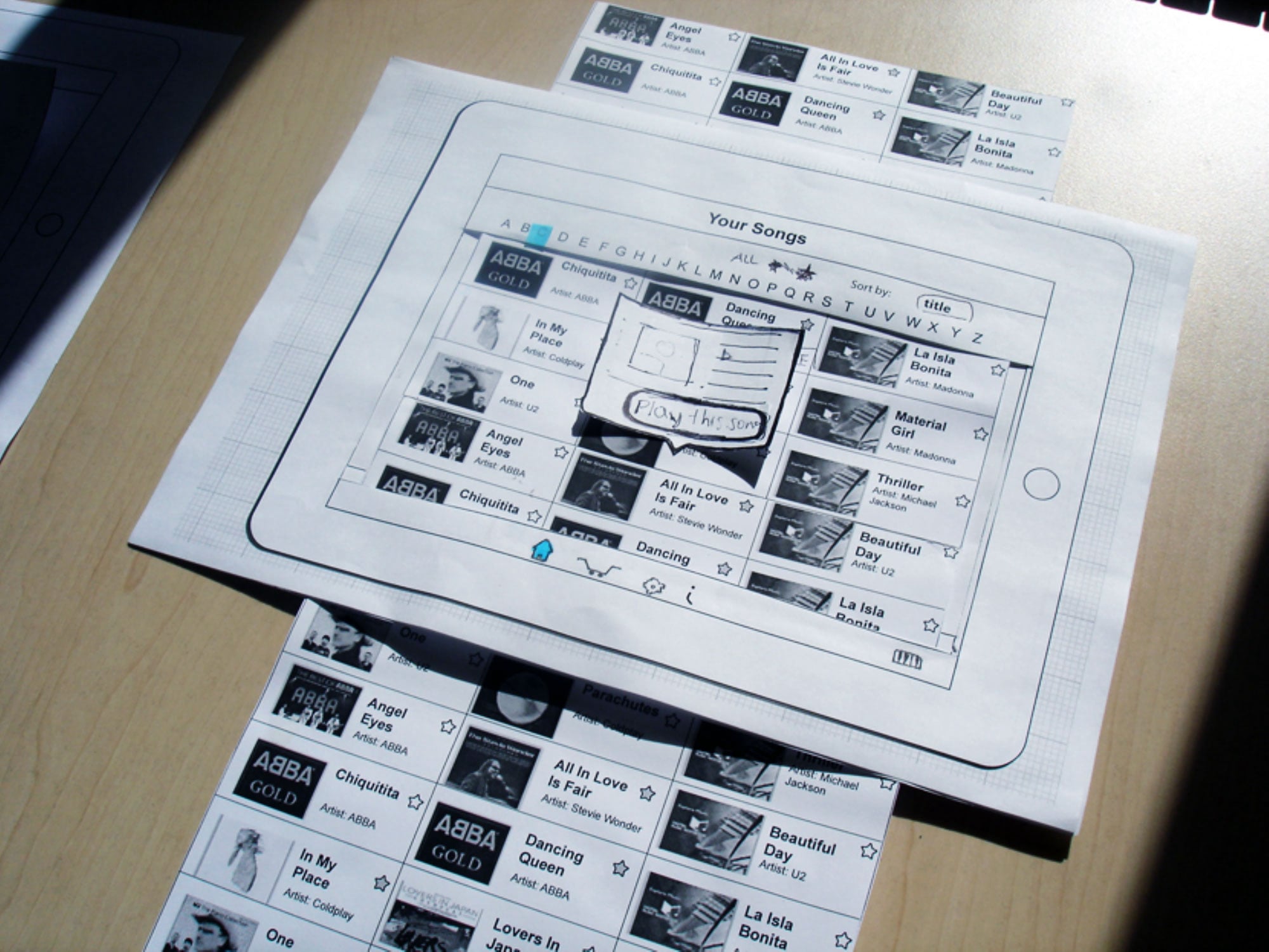
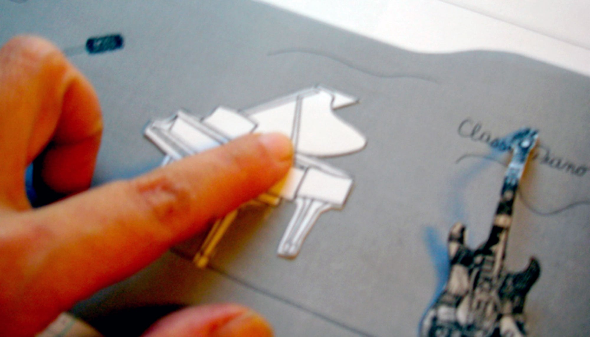
- Designed and ran paper prototyping workshops for rapid iteration
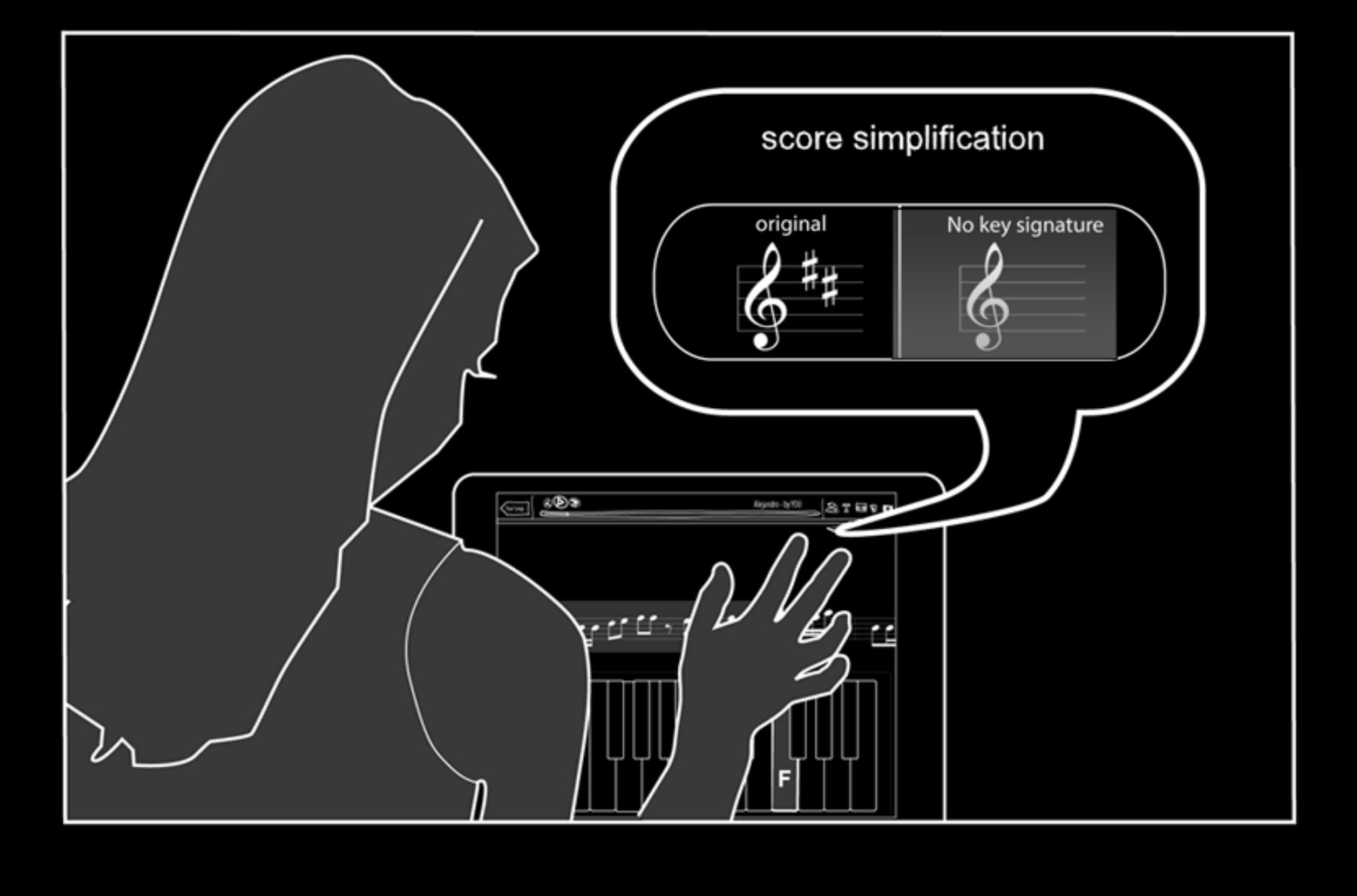
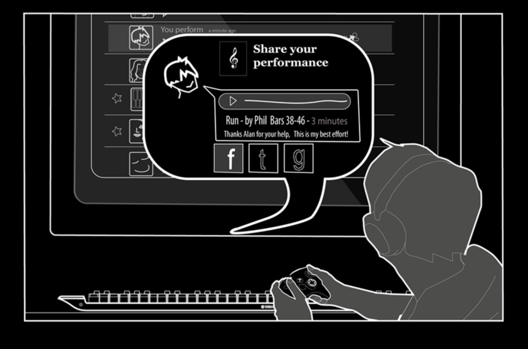
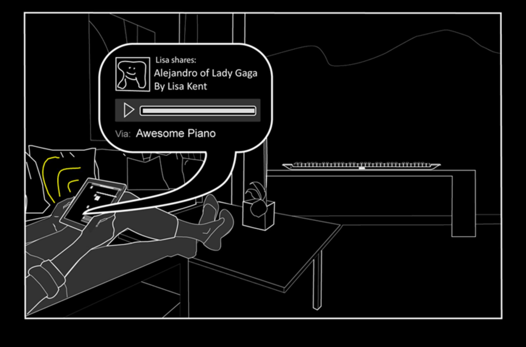
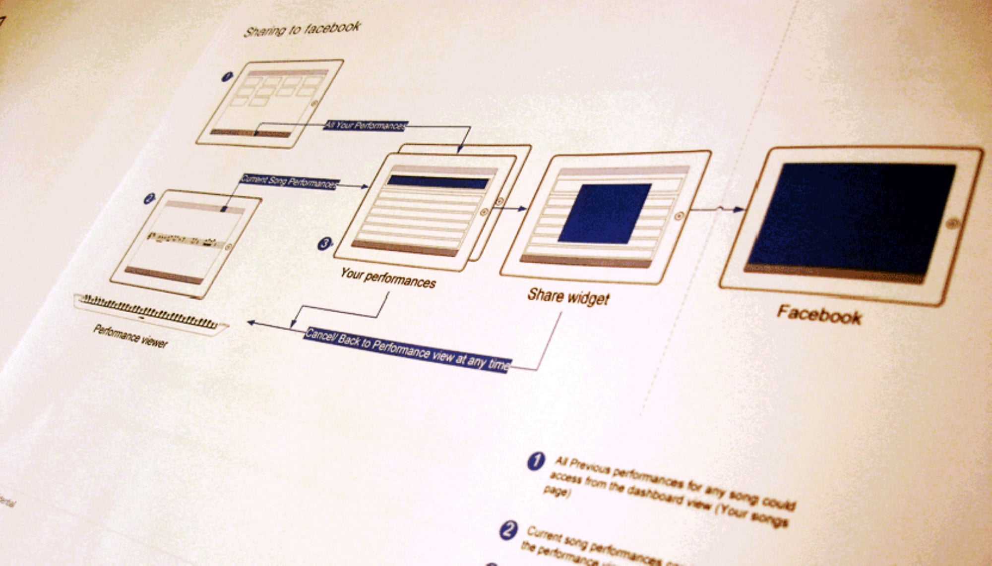
- Mapped interaction flows for social sharing, score browsing, and performance review
- Facilitated user testing with teenagers and parents; synthesized insights
- Developed hi-fi prototypes presented at Yamaha's Japan exhibition
Key Learnings
Designing for
Motivation
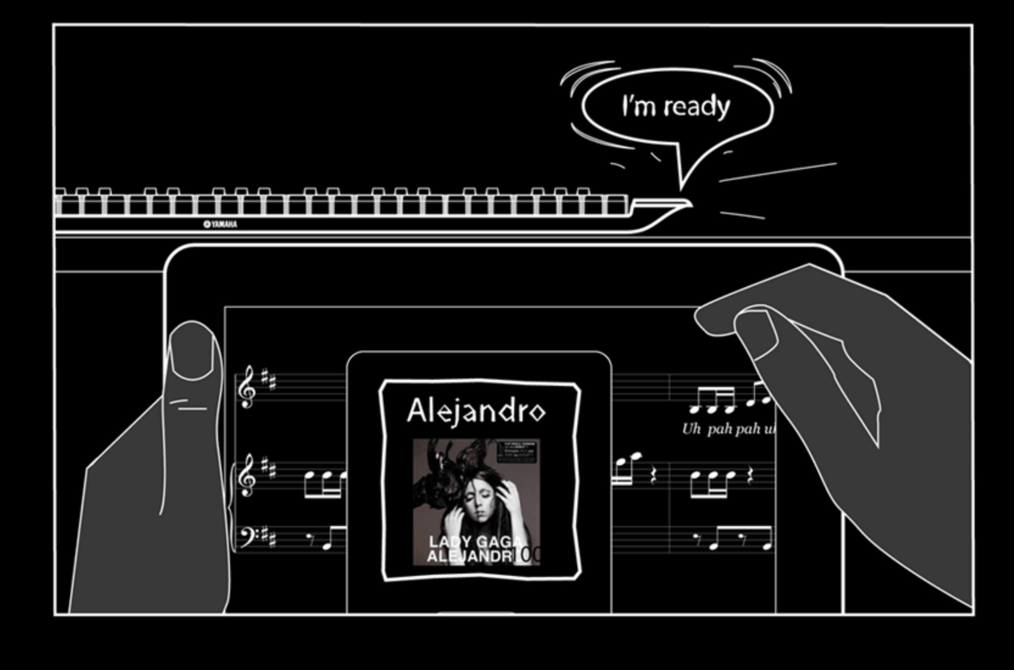
This project taught me that motivation is a design problem. The piano itself wasn't broken — the experience around it was. Once we put popular music at the center, added a social loop, and let learners control their own journey, everything shifted.
Working as the only designer in an engineering team sharpened my ability to translate UX thinking into terms engineers could build from. Paper prototypes, storyboards, and flow diagrams had to do heavy lifting — they weren't just design artifacts, they were communication tools.
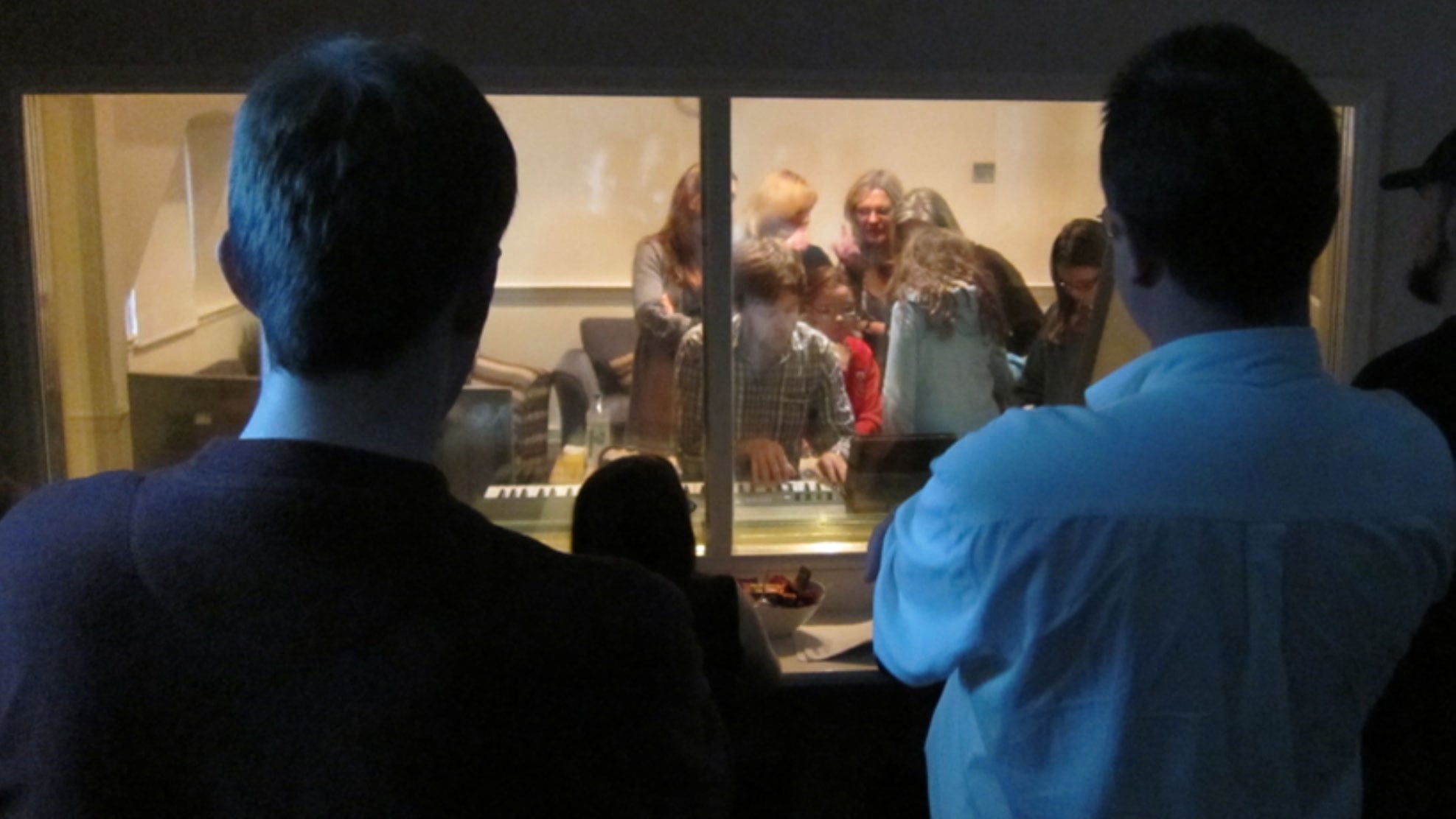
And the most powerful insight of all: people motivate people. No gamification mechanic we designed matched the motivational pull of seeing a friend share a performance of a song you both knew.